✦ Interior Design & Color Theory ✦
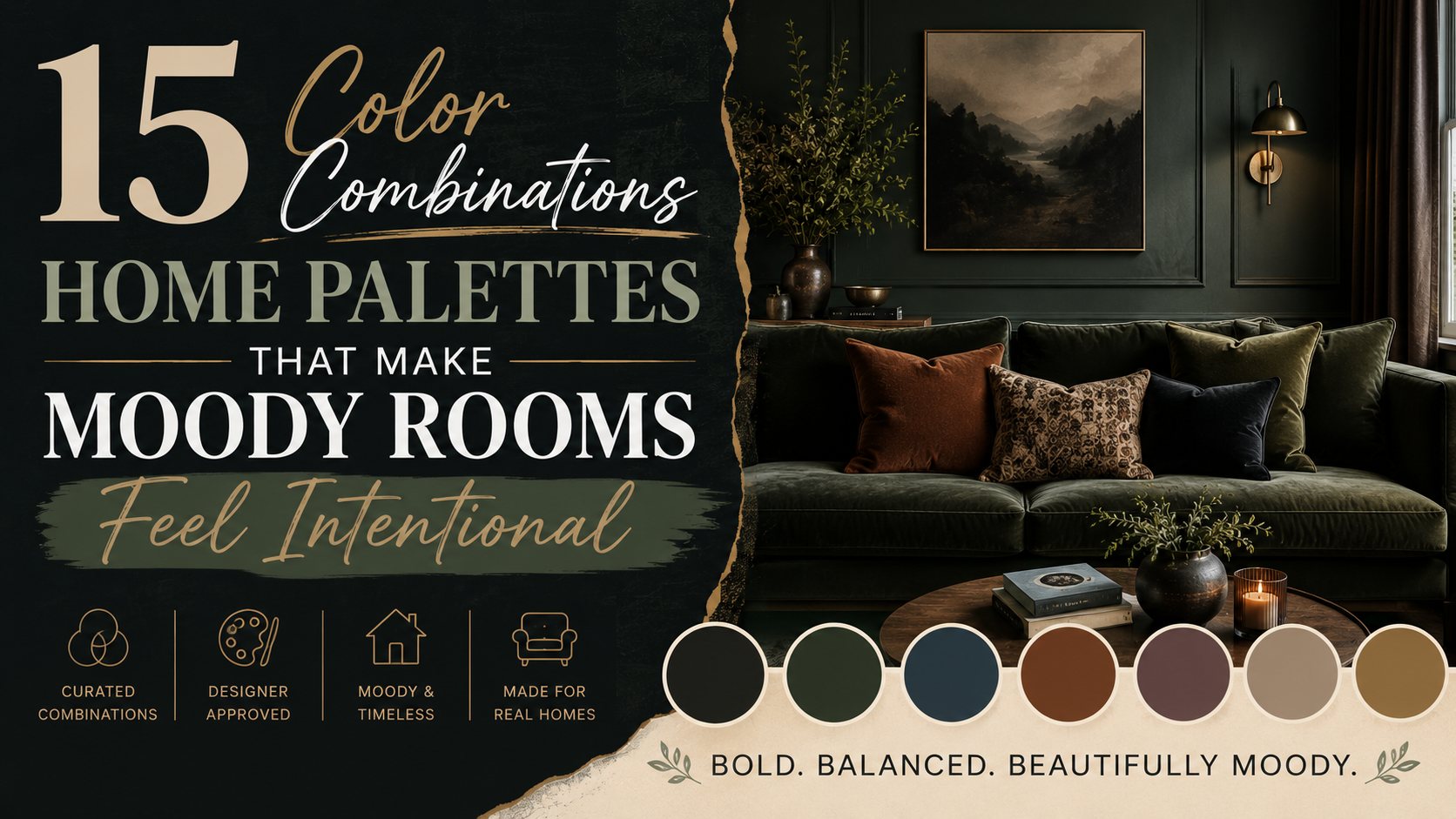
15 Color Combinations & Home Palettes That Make Moody Rooms Feel Intentional
A deep dive into the art of living with darkness, depth, and drama
There’s a moment when you walk into a room and feel it before you see it. The air is different. The light bends a certain way. Your shoulders drop, your breath slows, and something in you goes quiet. That’s what a well-done moody room does. It holds you.
But here’s the thing about moody interiors that most people get wrong: they assume “dark” means gloomy, accidental, or depressing. The truth is the opposite. A truly moody room is one of the most intentional spaces you can create. Every color has been chosen with care. Every combination has been tested. Every shadow is doing real work.
Over the years, designers have cracked the code on what separates a moody room that feels like a creative sanctuary from one that just feels like someone forgot to open the curtains. The answer is almost always the palette. Below, we’re breaking down 15 color combinations that bring out the best in moody interiors, with real-room application tips, styling notes, and the emotional personality each palette carries with it. 🏠
✦ ✦ ✦
01
🌑
Charcoal + Antique Brass + Cream
The Gentleman’s Study
Charcoal
Antique Brass
Cream
If there were a blueprint for the classic moody room, this would be it. Charcoal is the rare dark that manages to be warm and cool simultaneously, depending entirely on the light source you pair it with. In natural daylight, it reads almost silvery. Under warm incandescent bulbs, it deepens into something almost black.
Antique brass is the detail that does all the heavy lifting in this palette. Think cabinet hardware, floor lamps, curtain rods, picture frames, even the faucet if you’re doing a moody bathroom. The brass doesn’t compete with the charcoal; it converses with it. And cream, used on linens, trim, or one lighter wall, keeps the whole thing breathing.
💡 Pro tip: Paint four walls charcoal but leave the ceiling cream. The room will feel grounded without feeling like a cave. Add a brass chandelier and you’ve got yourself a room that looks like it took years to curate.
02
🌿
Forest Green + Cognac Leather + Raw Linen
The Botanist’s Parlor
Forest Green
Cognac
Raw Linen
Deep forest green is having a serious moment right now, and it’s not hard to see why. It connects us to something organic and ancient. Used as a wall color, especially in a satin or eggshell finish, it wraps a room in a richness that no wallpaper can fake. The color carries the memory of old libraries, dark ferns, and damp forest floors.
Cognac leather against forest green is one of those combinations that feels instinctively right, the way red wine looks against a wooden table. Warm and earthy, the leather softens the depth of the green without brightening it. Raw linen adds texture without adding color, which is exactly what you want here. A linen sofa, a jute rug, cream curtains, and you have a room that feels both sophisticated and genuinely livable. 🌱
💡 This palette ages beautifully. Cognac leather deepens over time, and forest green shifts with the seasons. It’s a living palette, not a static one.
03
🌊
Navy Blue + Tarnished Gold + Ivory
The Maritime Drawing Room
Navy Blue
Tarnished Gold
Ivory
Navy is the most versatile of the dark blues precisely because it contains multitudes. It can read preppy or aristocratic, coastal or city-chic. The shade that works best in a moody room leans slightly green, not the royal blue that tips toward purple. Think the color of the deep ocean at dusk rather than a dress uniform.
Tarnished gold, not polished or shiny, is what elevates this from a cliché nautical look to something genuinely atmospheric. The slight oxidation in the metal finish mirrors the depth in the navy walls. Ivory plays the role of light source here since walls, textiles, and trim in ivory keep the navy from feeling oppressive. 🌟
💡 In a dining room, this palette is almost unfairly good. The navy absorbs light beautifully by candlelight, and the gold accents glow. It’s the combination that makes dinner feel like an event.
04
🪨
Slate Gray + Dusty Rose + Warm White
The Romantic Minimalist
Slate Gray
Dusty Rose
Warm White
Don’t let the word “rose” scare you away from this palette. This isn’t a pink bedroom from a nursery catalog. Dusty rose, specifically the version that leans slightly terracotta and deeply muted, is one of the most sophisticated accent colors available to a moody room. It has the warmth of blush without any of the sweetness. Paired with slate gray, it reads as quietly melancholic in the most beautiful way.
This combination works especially well in bedrooms because it strikes the exact balance between cozy and composed. The slate grounds everything, the dusty rose adds warmth you can feel without being able to name, and the warm white in the linens and trim keeps it from becoming suffocating. 💕
💡 Use dusty rose in small doses: a velvet headboard, a ceramic lamp base, a single throw pillow cluster. Let the slate do the heavy work and let the rose surprise you.
05
🕯️
Deep Plum + Aged Bronze + Caramel
The Victorian Revisited
Deep Plum
Aged Bronze
Caramel
Deep plum is a commitment. It is not a color for people who are unsure. It’s saturated, dramatic, and borderline theatrical. But when you pair it with the right supporting cast, it stops being theatrical and starts being timeless. This combination pulls from the Victorian tradition without landing in costume territory. 🎭
Aged bronze in hardware and fixtures gives the room weight and seriousness. It says this room has history. Caramel, whether in a leather chair, wooden bookshelves, or a sisal rug, acts as the breath of warmth that keeps the plum from reading as cold or gothic. In a home library or a sitting room, this palette is essentially magic. It’s the kind of room people walk into and refuse to leave.
💡 If plum walls feel like too much, try plum on one architectural wall with the rest in a deep ivory or warm stone. The drama stays; the claustrophobia doesn’t.
06
🏔️
Warm Taupe + Black + Terracotta
The Desert Dusk
Warm Taupe
Black
Terracotta
This one feels like the Southwestern United States interpreted through a European design lens. It’s earthy, sun-baked, ancient, and deeply modern all at once. Taupe is the perfect backdrop because it doesn’t compete, it accommodates. It takes on the warmth of nearby terracotta and the edge of nearby black without losing its own calm identity.
Black used minimally, in thin-framed windows, an iron coffee table base, or a single matte black wall, introduces a graphic precision that keeps the palette from feeling muddy or indistinct. Terracotta is the hero here: in ceramic vessels, woven blankets, or painted pottery lining open shelving. This combination is grounded, full of texture, and quietly joyful. 🏺
💡 Layer your textiles heavily with this palette. Chunky wool, woven cotton, rough linen, rough-finished ceramics. Smoothness is the enemy of this aesthetic.
07
🌙
Midnight Blue + Silver + Pale Gray
The Lunar Interior
Midnight Blue
Silver
Pale Gray
Cool, collected, slightly otherworldly. This palette doesn’t come from the earth; it comes from somewhere farther away. Midnight blue in its truest form has a depth that pure navy never quite achieves. It’s not just dark; it’s dimensional. Light plays inside it differently at different hours, and in a room that sees natural light shift from morning to evening, that quality is extraordinary.
Silver accents here should stay brushed and matte, never polished to a mirror finish. The goal is reflection without flash, shimmer without distraction. Pale gray in textiles and soft furnishings ties the cool tones together. This palette works exceptionally well in a home office or a meditation room: any space where clarity and focus are the primary emotional goals. ✨
💡 Add a single aged mirror in this room. The reflected midnight blue and silver create a depth of visual field that makes even small rooms feel endless.
08
🍂
Burnt Sienna + Ochre + Deep Brown
The Autumnal Warmth
Burnt Sienna
Ochre
Deep Brown
Some rooms feel best in autumn. This palette captures that specific quality of late October light filtering through changing leaves, warm and amber and faintly melancholy. Burnt sienna as a wall color is arresting in the most welcoming way. It’s not red, not orange; it’s the color of old Moroccan tile and dried earth. 🍁
Ochre in textiles, whether a throw pillow or a painted lampshade, provides the golden note that keeps burnt sienna from feeling too intense. And deep brown, in wide-plank wooden floors, a dark walnut dining table, or a rich espresso bookcase, anchors the whole palette to the ground in the most literal sense. This palette makes a kitchen or a dining space feel nourishing before a single meal is cooked.
💡 Natural beeswax candles in terracotta holders, scattered throughout this palette, create a glow that no lightbulb can fully replicate. This room was made for candlelight.
09
🌫️
Eucalyptus Gray + Sage + Bone White
The Nordic Fog
Eucalyptus Gray
Sage
Bone White
Not all moody rooms are dark. Some of the most atmospheric spaces are built from quiet, muted tones that hover just above white without ever committing to color. Eucalyptus gray, a green-gray that shifts between blue and green depending on light, is one of the most sophisticated paint colors available. It rewards patience; you have to live with it through different weather before you understand it fully.
Sage here isn’t the bright herb-garden sage. It’s deeper, more silvery, almost the color of dried lavender stems. Against eucalyptus gray, it creates a harmony that feels almost acoustic, a room that feels quietly hushed. Bone white in linen, cotton, and natural plaster keeps it bright enough to live in daily without losing any of its contemplative quality. 🕊️
💡 This palette thrives with natural light and real plants. An olive tree in a clay pot, eucalyptus branches in a glass vase. Bring the outdoors in; this room is designed to blur that boundary.
10
🖤
Matte Black + Raw Concrete + Amber
The Industrial Meditation
Matte Black
Raw Concrete
Amber
Industrial design gets a bad reputation for being cold and uninviting. But when it’s done with real intention, it can be profoundly calming. The key is understanding what the materials are saying: matte black is structure and discipline, raw concrete is honesty and permanence, and amber, the color of old resin and warm whiskey, is where all the humanity lives.
In this palette, amber can come from Edison bulbs strung low over a dining table, from glass vessels filled with dried botanicals, from the honey tones in a natural wood cutting board left out on a concrete countertop. The warmth is earned, not given. And because it has to work against those serious, demanding backgrounds, it feels extraordinarily alive. ⚡
💡 Never use overhead fluorescent lighting in this palette. The entire effect collapses. Commit to warm-spectrum bulbs at low wattage, positioned low and close to surfaces.
11
🍷
Wine Red + Dark Oak + Cream
The Intimate Dining Room
Wine Red
Dark Oak
Cream
Wine red is underused in contemporary interiors. We’ve been so busy with the neutrals and the dusty greens that we’ve forgotten what a true deep red can do to a room. It creates intimacy. It makes people sit closer, talk longer, eat slower. There’s a reason the best restaurants in the world have been using variations of this palette for decades. 🍽️
Dark oak, whether in furniture, exposed beams, or wooden floors, is the natural partner. It has the same earthiness as the red but brings texture and structure that grounds the warmth. Cream breaks things up just enough. A cream tablecloth, cream candle tapers, cream curtains in heavy cotton, letting the wine red walls do their work in the background without competition.
💡 This palette sings in rooms with candlelight. The wine red walls absorb and reflect the flame in ways that make the color seem to move. It’s the closest thing to magic that interior design offers.
12
🦚
Teal + Chocolate Brown + Mustard
The Eclectic Sanctuary
Teal
Chocolate Brown
Mustard
This is the palette for people who aren’t afraid of color. It doesn’t whisper; it declares. And yet, in the right hands, it’s not aggressive at all. It’s exuberant in the most intentional way. Teal at its most saturated has a depth that feels almost jewel-like. In a velvet sofa or a lacquered accent wall, it stops conversations. 💎
Chocolate brown is the anchor that keeps the palette from feeling costume-like. Deep, warm, and woodsy, it appears in leather, in dark wooden furniture, in the frame of a large painting. And mustard, used sparingly in ceramics or a single textile accent, introduces a vibrancy that makes the whole room feel handcrafted and globally-informed. This is the palette of someone who has traveled and paid attention.
💡 Don’t be afraid to mix pattern here. A kilim rug, batik cushions, and geometric tiles can all coexist because the palette itself is doing the unifying work.
13
🌸
Mauve + Charcoal Linen + Aged Silver
The Quiet Romance
Mauve
Charcoal Linen
Aged Silver
Mauve is perpetually underestimated. People either dismiss it as outdated or overuse it until it becomes cliché. But in its truest, most complex form, mauve carries a melancholy that no other color quite replicates. It’s the color of faded petals, of late afternoon light in late winter, of a love letter that was never sent. Used on walls or in heavily layered textiles, it creates a room with an emotional resonance that’s hard to explain and impossible to ignore. 💜
Charcoal linen in upholstered furniture does something extraordinary against mauve walls: it absorbs the warmth of the mauve and reflects it back at a lower register, like a conversation conducted in whispers. Aged silver in mirrors and fixtures keeps the room from becoming too heavy or too sentimental. This palette is ideal for bedrooms and reading rooms.
💡 Use aged or antique mirrors rather than modern-framed ones. The slightly fogged, imperfect reflections in vintage mirrors suit the quiet, dreamlike quality of this palette perfectly.
14
🌋
Obsidian + Rust Orange + Natural Stone
The Volcanic Drama
Obsidian
Rust Orange
Natural Stone
This is the boldest palette on this list. Obsidian, a black with the faintest blue-black undertone, is not for the faint of heart. As a wall color, it demands respect. But here’s what happens in an obsidian room that most people don’t anticipate: it makes everything else incandescent. Art looks more vivid. Textiles look more luxurious. Candles glow warmer. People’s faces look more beautiful. 🔥
Rust orange here should be used structurally, not decoratively: in a statement sofa, in curtains, in an area rug. Not a throw pillow. Rust orange has to carry some weight to work against obsidian; if it’s too small, the obsidian just swallows it. Natural stone, in the floor tiles, a raw marble side table, or limestone fireplace surround, provides the visual and textural relief that makes the drama sustainable day to day.
💡 If you’re attempting obsidian walls, paint the ceiling the same shade. The room transforms from a box into an atmosphere. It’s genuinely one of the most powerful moves in moody interior design.
15
☁️
Storm Gray + Deep Navy + Soft Blush
The Elegant Contradiction
Storm Gray
Deep Navy
Soft Blush
We end where most people are afraid to begin: with a combination that seems contradictory on paper but resolves beautifully on the wall. Storm gray and deep navy are both cool, both authoritative, both serious. Soft blush is warm, gentle, and delicate. Put them together and something unexpected happens: the harshness of the darks softens, and the sweetness of the blush deepens.
This is a palette about productive contradiction. It’s serious and tender at once. It’s the visual equivalent of a complex person, someone who is thoughtful and a little difficult and entirely worth knowing. In a bedroom or a private sitting room, this combination creates an emotional safety that has nothing to do with simplicity. It earns its intimacy. 🌅
💡 Soft blush works best here in a velvet or silk texture. The sheen catches light differently from the matte darks, creating a visual tension that keeps the palette alive rather than static.
✦ ✦ ✦
The Room That Knows Itself 🏡
Every palette on this list shares a common quality: they are rooms that have made decisions. They haven’t hedged their bets or tried to appeal to everyone. They’ve committed, and in that commitment, they’ve created something that feels genuinely human.
The moody room doesn’t apologize for its darkness. It doesn’t try to be brighter. It understands that depth is not a flaw to be corrected but a quality to be cultivated. And when the combination is right, when the colors support each other the way the best relationships do, the result isn’t just a beautiful room.
It’s a place where you can exhale. And that, in the end, is the highest compliment any interior can receive. 🕯️ ✦ Written with intention for homes that dare to be different ✦